 goome
Themes
goome_ui_theme(u) hands you the goome_theme the UI draws with. Change any field and the next frame uses it.
goome_theme *t = goome_ui_theme(u);
t->accent = 0xFF4FA3FF;
t->radius = 6;
t->font_size = 15;
ui.Theme.Accent = 0xFF4FA3FF;
ui.Theme.Radius = 6;
ui.Theme.FontSize = 15;
ui.theme.accent = 0xFF4FA3FF
ui.theme.radius = 6
ui.theme.font_size = 15
ui.theme().accent(0xFF4FA3FF).radius(6).fontSize(15);
Dark and light
goome_ui_theme_dark(t) and goome_ui_theme_light(t) reset every color and size to the built in ones. They leave the font alone. Dark is the default.
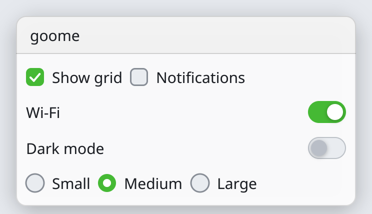
The fields
| Field | What |
|---|---|
bg |
behind everything, app mode fills with it |
panel |
window background |
border |
window and widget outlines |
text, text_dim |
normal and quieter text |
accent, accent_text |
checked boxes, slider fill, the active tab, and text on top of it |
hover, active |
widget backgrounds while hovered and pressed |
input_bg |
inside inputs, sliders and combos |
shadow |
window shadow color |
radius |
corner radius |
pad, gap |
space inside windows and between widgets |
border_width |
outline width |
font_size |
text size, checkboxes and knobs grow with it |
shadow_blur |
how soft window shadows are |
anim_ms |
how long hovers and toggles take, 0 turns animation off |
font |
a goome_font, NULL = built in |
skin_button, skin_panel, skin_input 0.2 |
optional nine-slice bitmaps, see skins |
icon, icon_tint, the other skin_* 0.3 |
your own pictures, see Icons and skins |
goome_ui_new puts the system font in font and frees it in goome_ui_free. Your own font you free yourself, after goome_ui_free.
0.2 has a lot more fields after these, every number and color the kit uses. Theyre on Change anything. For a quick look without touching fields theres Themes the simple way.
Colors are 0xAARRGGBB. Panel alpha below FF lets the desktop show through in overlay mode. 0.2 only added fields at the end, old code still works.