 goome
Change anything 0.3
Every number and color the ui kit used to have baked in is a theme field or a config field now. If you dont touch them it looks and acts exactly like before.
For a quick look start at Themes the simple way, this page is the full list.
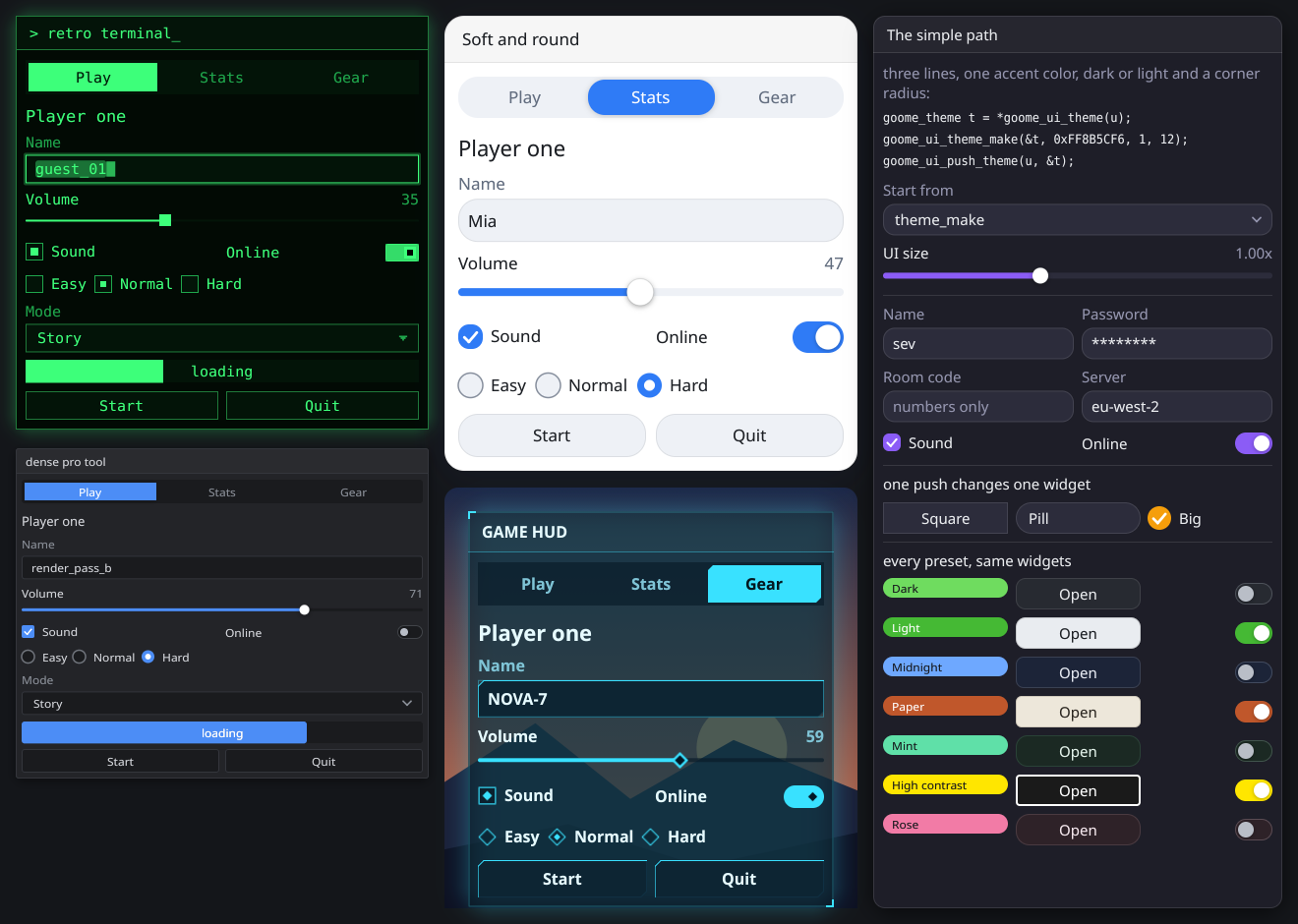
examples/anything.c in c-goome. Same widgets 4 times, only the theme and the config are different.
Theme fields
Change them on goome_ui_theme(u) like in Themes, or push one for a few widgets with its GOOME_S_* name. Every field from focus on has one too:
goome_ui_push_num(u, GOOME_S_CHECK_SIZE, 24);
goome_ui_push_color(u, GOOME_S_FOCUS, 0xFFFFB020);
goome_ui_checkbox(u, "Big one", &big);
goome_ui_pop(u, 2);
ui.PushNum(Style.CheckSize, 24);
ui.PushColor(Style.Focus, 0xFFFFB020);
ui.Checkbox("Big one", ref big);
ui.Pop(2);
ui.push_num("check_size", 24)
ui.push_color("focus", 0xFFFFB020)
big = ui.checkbox("Big one", big)
ui.pop(2)
ui.pushNum(Style.CHECK_SIZE, 24);
ui.pushColor(Style.FOCUS, 0xFFFFB020);
big = ui.checkbox("Big one", big);
ui.pop(2);
Defaults are what goome_ui_theme_dark sets. goome_ui_theme_light only changes the first 11 colors.
The old ones
| Field | Default | What |
|---|---|---|
bg |
0xFF14161A |
behind everything, app mode fills with it |
panel |
0xEC1B1D22 |
window background |
border |
0x1CFFFFFF |
outlines |
text |
0xFFE9EBEE |
normal text |
text_dim |
0xFF969CA6 |
quieter text |
accent |
0xFF6FDC5F |
checked boxes, slider fill, the active tab |
accent_text |
0xFF0F1D0C |
text on top of the accent |
hover |
0xFF363A44 |
widget background while hovered |
active |
0xFF424752 |
widget background while pressed |
input_bg |
0xFF272A31 |
inside inputs and sliders |
shadow |
0x8C000000 |
window shadow |
radius |
10 | corner radius |
pad |
10 | space inside windows |
gap |
8 | space between widgets |
border_width |
1 | outline width |
font_size |
15 | text size |
shadow_blur |
22 | how soft shadows are |
anim_ms |
120 | animation length, 0 = no animation |
font |
system font | NULL = built in |
skin_* |
none | Icons and skins |
icon[GOOME_ICON_COUNT] |
all NULL | Icons and skins |
icon_tint |
0 | 1 = draw icons as they are, no tint |
Colors
0 means work it out from the other colors like it always did, so pushing the accent still moves the focus ring with it.
| Field | Default | What, and what 0 uses |
|---|---|---|
focus |
0 | focus ring and the input glow, 0 = accent |
select |
0 | selected text, 0 = accent faded |
caret |
0 | the text caret, 0 = accent |
link |
0 | goome_ui_link, 0 = accent |
badge |
0 | goome_ui_badge with color 0, 0 = accent |
toast |
0 | toast background, 0 = panel mixed with hover |
tooltip |
0 | tooltip background, 0 = bg mixed with hover |
danger |
0 | the red close buttons, 0 = the built in red |
knob |
0 | slider and toggle knobs, 0 = white |
dim |
0 | behind modals, 0 = 0x73000000 |
Sizes
The ones marked em are at font size 15 and grow with the font like before. Heights at 0 come from the font.
| Field | Default | What |
|---|---|---|
check_size |
18 em | checkbox and radio box |
check_radius |
5 | checkbox corners |
toggle_w, toggle_h |
38, 22 em | toggle track |
slider_h |
22 em | slider height |
slider_track |
6 | slider track thickness |
knob_size |
8 em | slider knob radius |
scroll_w |
4 | scrollbar width |
scroll_min |
28 | shortest a scrollbar thumb gets |
item_h |
0 | every widget row, 0 = line height + pad |
menu_item_h |
0 | menu rows |
tab_h |
0 | tabs |
win_title_h |
0 | window title bar |
app_title_h |
0 | app mode title bar |
menubar_h |
0 | app menubar |
statusbar_h |
0 | app statusbar |
focus_w |
2 | focus ring width |
focus_gap |
3 | space between the widget and its focus ring |
sep_w |
1 | separator thickness |
grip |
18 | window resize grip |
indent |
16 em | tree indent |
plot_w |
2 em | plot line width |
spinner |
0 | goome_ui_spinner size when you pass 0, 0 = line height |
caret_w |
0 | caret width, 0 = thin. Go wide for a block caret |
win_min_w, win_min_h |
140, 50 | smallest a window resizes to |
pop_gap |
6 | space between a combo or popup and what opened it |
menu_gap |
3 | offset of submenus |
tip_pad_x, tip_pad_y |
10, 7 | padding in tooltips |
tip_x, tip_y |
14, 20 | tooltip spot from the mouse |
tip_radius |
8 | tooltip corners |
shadow_x, shadow_y |
0, 5 | shadow offset |
check_size, toggle_w, toggle_h, slider_h, slider_track, knob_size, scroll_w, scroll_min and grip cant be 0, at 0 or less they go back to the default. So a theme you memset and only filled half of still draws.
Text
| Field | Default | What |
|---|---|---|
align |
GOOME_ALIGN_AUTO |
button and label text, GOOME_ALIGN_LEFT, _CENTER or _RIGHT. Auto is what each widget normally does |
heading_size |
0 | goome_ui_heading, 0 = 1.3x the font size |
small_size |
0 | badges and the statusbar, 0 = a bit under the font size |
font_heading |
NULL | headings, NULL = font |
font_mono |
NULL | the text editor with GOOME_EDIT_MONO, NULL = built in mono |
font_small |
NULL | badges and the statusbar, NULL = font |
Motion
| Field | Default | What |
|---|---|---|
ease |
GOOME_EASE_SMOOTH |
_LINEAR, _OUT, _IN_OUT, _BACK or _CUSTOM for the ease function in the config |
hover_ms |
-1 | hover fades |
press_ms |
-1 | press fades |
popup_ms |
-1 | popups and menus opening |
collapse_ms |
-1 | anything that folds open or shut |
toast_fade_ms |
-1 | toasts fading out |
Below 0 they follow anim_ms.
goome_ui_scale(u, s) multiplies every size above that isnt em, plus the old sizes. See Themes the simple way.
The config
Stuff that isnt a look goes in goome_ui_cfg(u). There’s one per ui and it can’t be pushed, a tooltip delay changing halfway through a frame doesnt mean anything.
goome_ui_config *cfg = goome_ui_cfg(u);
cfg->tip_delay_ms = 200;
cfg->blink_ms = 0;
cfg->cursor[GOOME_CUR_BUTTON] = GOOME_CURSOR_HAND;
ui.Config.TipDelayMs = 200;
ui.Config.BlinkMs = 0;
ui.Config[CursorKind.Button] = CursorShape.Hand;
ui.config.tip_delay_ms = 200
ui.config.blink_ms = 0
ui.config.cursor[goome.CUR_BUTTON] = goome.CURSOR_HAND
Config cfg = ui.config();
cfg.tipDelayMs(200);
cfg.blinkMs(0);
cfg.cursor(Config.CUR_BUTTON, Goome.CURSOR_HAND);
| Field | Default | What |
|---|---|---|
tip_delay_ms |
500 | hover time before a tooltip shows |
dbl_click_ms |
450 | max time between the clicks of a double click |
dbl_click_px |
5 | how far the mouse can move between them |
drag_px |
4 | how far before a press turns into a drag |
repeat_delay_ms |
380 | held key or GOOME_ITEM_REPEAT before it starts repeating |
repeat_ms |
55 | then once every this |
blink_ms |
530 | caret blink, 0 = no blink |
menu_delay_ms |
120 | hover time before a submenu opens |
toast_ms |
3000 | how long goome_ui_toast with 0 ms stays |
scroll_lines |
3 | lines per wheel step |
raise_on_click |
1 | clicking a window brings it to the front |
esc_closes |
1 | esc closes the top popup or modal |
tab_nav |
1 | tab and shift+tab move focus |
focus_on_mouse |
0 | 1 = clicking a widget focuses it and shows the focus ring |
cursor[GOOME_CUR_COUNT] |
below | the cursor each kind of widget asks for |
keys[GOOME_ACT_COUNT][4] |
below | the key map, set it with goome_ui_bind |
ease, ease_user |
NULL | double ease(double t, void *user) for GOOME_EASE_CUSTOM, t goes 0 to 1 |
mask |
NULL | what a password input draws per letter, NULL = "*" |
goome_ui_config_default(c) fills one with the defaults, for a reset button or to start your own. C# and Python have ui.Config.Reset() and ui.config.reset() for the ui’s own one, Java has ui.config().reset().
Cursors
| Slot | Default |
|---|---|
GOOME_CUR_BUTTON |
GOOME_CURSOR_ARROW |
GOOME_CUR_INPUT |
GOOME_CURSOR_IBEAM |
GOOME_CUR_LINK |
GOOME_CURSOR_HAND |
GOOME_CUR_DRAG_VALUE |
GOOME_CURSOR_RESIZE_EW |
GOOME_CUR_SPLIT_X |
GOOME_CURSOR_RESIZE_EW |
GOOME_CUR_SPLIT_Y |
GOOME_CURSOR_RESIZE_NS |
GOOME_CUR_GRIP |
GOOME_CURSOR_RESIZE_NWSE |
GOOME_CUR_COLUMN |
GOOME_CURSOR_RESIZE_EW |
GOOME_CUR_DRAG_DROP |
GOOME_CURSOR_MOVE |
GOOME_CUR_CUSTOM_X |
GOOME_CURSOR_RESIZE_EW |
GOOME_CUR_CUSTOM_Y |
GOOME_CURSOR_RESIZE_NS |
GOOME_CUR_CUSTOM_XY |
GOOME_CURSOR_MOVE |
The custom ones are custom widgets with GOOME_ITEM_DRAG_X, _DRAG_Y or both. Set GOOME_CUR_BUTTON to GOOME_CURSOR_HAND for web style buttons.
The key map
goome_ui_bind(u, GOOME_ACT_WORD_LEFT, "alt+left");
goome_ui_bind(u, GOOME_ACT_SELECT_ALL, "ctrl+a super+a ctrl+l");
goome_ui_bind(u, GOOME_ACT_PASTE, NULL);
ui.Config.Bind(KeyAction.WordLeft, "alt+left");
ui.Config.Bind(KeyAction.SelectAll, "ctrl+a super+a ctrl+l");
ui.Config.Bind(KeyAction.Paste, null);
ui.config.bind(goome.ACT_WORD_LEFT, "alt+left")
ui.config.bind(goome.ACT_SELECT_ALL, "ctrl+a super+a ctrl+l")
ui.config.bind(goome.ACT_PASTE, None)
ui.config().bind(Config.ACT_WORD_LEFT, "alt+left");
ui.config().bind(Config.ACT_SELECT_ALL, "ctrl+a super+a ctrl+l");
ui.config().bind(Config.ACT_PASTE, null);
goome_ui_bind(u, act, combos) replaces every key on that action. Up to 4 combos split by spaces or commas, written like hotkeys. NULL or “” takes them all off. It returns GOOME_EARG if none of them parsed, Python raises then and Java gives back false.
| Action | Default |
|---|---|
GOOME_ACT_COPY |
ctrl+c super+c |
GOOME_ACT_CUT |
ctrl+x super+x |
GOOME_ACT_PASTE |
ctrl+v super+v |
GOOME_ACT_UNDO |
ctrl+z super+z |
GOOME_ACT_REDO |
ctrl+y ctrl+shift+z super+y super+shift+z |
GOOME_ACT_SELECT_ALL |
ctrl+a super+a |
GOOME_ACT_WORD_LEFT |
ctrl+left super+left |
GOOME_ACT_WORD_RIGHT |
ctrl+right super+right |
GOOME_ACT_DEL_WORD_LEFT |
ctrl+backspace super+backspace |
GOOME_ACT_DEL_WORD_RIGHT |
ctrl+delete super+delete |
GOOME_ACT_DOC_START |
ctrl+home super+home |
GOOME_ACT_DOC_END |
ctrl+end super+end |
They count in inputs and the text editor. A binding matches when all its mods are held and the only extra one is shift, since shift turns a move into a select. When two match the one with more mods wins, so ctrl+shift+z is redo and not undo. Plain keys like the arrows or backspace arent in the map and still do their normal thing. The full key list is on Keyboard and focus.
Full list of calls on API: more ui widgets and the structs on API: types and constants.