 goome
Custom everything 0.3
Every look setting can change for just a few widgets, widgets can go at an exact spot, and your own widgets get handled the same way the built in ones are.
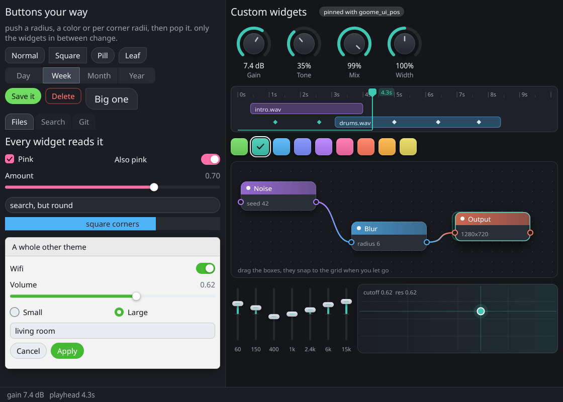
examples/custom.c in c-goome. The right side is all custom widgets, the left is normal widgets with styles pushed.
Push, draw, pop
goome_ui_push_num(u, GOOME_S_RADIUS, 999);
goome_ui_push_color(u, GOOME_S_INPUT_BG, 0xFF6FDC5F);
goome_ui_push_color(u, GOOME_S_TEXT, 0xFF0F1D0C);
goome_ui_button(u, "Save");
goome_ui_pop(u, 3);
using (ui.Style(radius: 999, inputBg: 0xFF6FDC5F, text: 0xFF0F1D0C))
    ui.Button("Save");
with ui.style(radius=999, input_bg=0xFF6FDC5F, text=0xFF0F1D0C):
    ui.button("Save")
try (var s = ui.style().radius(999).inputBg(0xFF6FDC5F).text(0xFF0F1D0C).push()) {
    ui.button("Save");
}
Only the widgets between the push and the pop change. Every built in widget reads from it, so radius 0 gives square buttons and 999 gives pills.
| Call | Pushes |
|---|---|
goome_ui_push_color(u, what, argb) |
one color, GOOME_S_BG to GOOME_S_SHADOW and GOOME_S_FOCUS to GOOME_S_DIM |
goome_ui_push_num(u, what, v) |
one number, GOOME_S_RADIUS to GOOME_S_ANIM_MS and the new ones |
goome_ui_push_radii(u, r) |
per corner radius, beats GOOME_S_RADIUS until it’s popped |
goome_ui_push_font(u, f) |
a font, NULL = built in |
goome_ui_push_skin(u, kind, s) |
a skin, any GOOME_SKIN_*, NULL = none |
goome_ui_push_icon(u, icon, b) |
one icon, any GOOME_ICON_*, NULL = built in |
goome_ui_push_theme(u, t) |
a whole theme, counts as one push |
goome_ui_pop(u, n) |
undoes the last n pushes of any kind |
The GOOME_S_* names are the theme fields in the same order. A pushed font size or pad changes widget heights too. Forget a pop and goome_ui_end pops it for you and says so once in goome_error.
C# has ui.PushColor(Style.Accent, ...), ui.PushNum, ui.PushRadii, ui.PushFont, ui.PushSkin, ui.PushTheme and ui.Pop(n) too. Python has ui.push_color("accent", ...) and the rest, plus ui.pop(n). Java has ui.pushColor(Style.ACCENT, ...), ui.pushNum and the rest with ui.pop(n), and ui.style() pushes a few in a try and pops them when it ends.
Corners and whole themes
goome_ui_push_radii(u, (goome_radii){12, 12, 0, 0});
goome_ui_button(u, "Files");
goome_ui_pop(u, 1);
goome_radii is {tl, tr, br, bl}. Thats tabs, {16, 3, 16, 3} is a leaf.
goome_theme t = *goome_ui_theme(u);
goome_ui_theme_light(&t);
t.radius = 8;
goome_ui_push_theme(u, &t);
if (goome_ui_window(u, "Light one", &x, &y, &w, &h, 0, NULL)) goome_ui_toggle(u, "Wifi", &wifi);
goome_ui_window_end(u);
goome_ui_pop(u, 1);
goome_ui_theme_light leaves the font alone, so the copy keeps yours.
Exact spots
goome_ui_pos(u, 176, 3);
goome_ui_badge(u, "pinned here", 0x26FFFFFF);
goome_ui_size(u, 74, 0);
goome_ui_button(u, "Week");
goome_ui_pos(u, x, y) puts the next widget at x,y from the top left of the window, pane or app content, scroll included. The layout carries on like it wasnt there. goome_ui_size(u, w, h) sets the next widgets size, 0 keeps its own for that side. goome_ui_width still does what it did.
C# is ui.Pos(x, y) and ui.Size(w, h), Python ui.pos(x, y) and ui.size(w, h), Java the same as Python.
Your own widgets
double *gain = goome_ui_store(u, "gain", 1);
goome_ui_item it;
goome_ui_custom(u, "gain", 80, 80, GOOME_ITEM_DRAG_Y | GOOME_ITEM_FOCUSABLE, &it);
if (gain && it.held) gain[0] -= it.dy / 200;
if (gain && gain[0] < 0) gain[0] = 0;
if (gain && gain[0] > 1) gain[0] = 1;
goome_canvas *c = goome_ui_canvas(u);
if (c && gain) goome_draw_arc(c, it.x + 40, it.y + 40, 30, 6, 2.36, 2.36 + 4.71 * gain[0], goome_ui_theme(u)->accent);
var gain = ui.Store("gain", 1);
ui.Custom("gain", 80, 80, ItemFlags.DragY | ItemFlags.Focusable, out var it);
if (it.Held) gain[0] = Math.Max(0, Math.Min(1, gain[0] - it.Dy / 200));
ui.Canvas()?.DrawArc(it.X + 40, it.Y + 40, 30, 6, 2.36, 2.36 + 4.71 * gain[0], ui.Theme.Accent);
gain = ui.store("gain", 1)
it = ui.custom("gain", 80, 80, goome.ITEM_DRAG_Y | goome.ITEM_FOCUSABLE)
if it.held:
    gain[0] = min(1, max(0, gain[0] - it.dy / 200))
c = ui.canvas
if c:
    c.arc(it.x + 40, it.y + 40, 30, 6, 2.36, 2.36 + 4.71 * gain[0], ui.theme.accent)
DoubleBuffer gain = ui.store("gain", 1);
Item it = ui.custom("gain", 80, 80, ItemFlag.DRAG_Y, ItemFlag.FOCUSABLE);
if (it.held()) gain.put(0, Math.max(0, Math.min(1, gain.get(0) - it.dy() / 200)));
Canvas c = ui.canvas();
if (c != null) c.arc(it.x() + 40, it.y() + 40, 30, 6, 2.36, 2.36 + 4.71 * gain.get(0), ui.theme().accent());
Thats a knob. goome_ui_custom takes a spot like any widget (and listens to goome_ui_pos / goome_ui_size), adds the hit rect and handles the mouse and tab focus like a built in widget. It returns 1 when anything happened this frame. w 0 is the normal widget width, h 0 is one line.
| Flag | What |
|---|---|
GOOME_ITEM_DRAG_X |
draggable, on its own it only moves sideways |
GOOME_ITEM_DRAG_Y |
draggable, on its own only up and down. Both flags = free drag |
GOOME_ITEM_FOCUSABLE |
gets tab focus and the keys in it.key |
GOOME_ITEM_NO_HIT |
never hovered or pressed, for a background you put other widgets on |
GOOME_ITEM_REPEAT |
clicked fires on the press and then keeps firing while held |
With a drag flag it grabs like a slider does (Taking input from the game). Without one its a button and never grabs. A focused one gets the keys raw with GOOME_SHIFT and friends ored in. Only tab and shift+tab still move focus and esc drops it. Enter or space counts as a click. When two overlap the one you call first gets the press, so backgrounds want GOOME_ITEM_NO_HIT.
What you get back
| Field | |
|---|---|
x, y, w, h |
where it ended up, logical |
hovered, pressed, held, released, clicked |
this frame. pressed is the down, held every frame after, clicked a release on it |
double_clicked, right_clicked, focused |
|
mx, my |
the pointer |
dx, dy |
moved this frame while held, after the axis lock |
drag_x, drag_y |
moved since the press, after the axis lock |
key |
the key pressed this frame while focused, 0 = none |
it.x and it.y are canvas coords and goome_ui_pos counts from the content top left. examples/custom.c puts a 1x1 GOOME_ITEM_NO_HIT item at goome_ui_pos(u, 0, 0) first and uses its x,y as the origin to turn one into the other.
Drawing it and keeping state
goome_ui_canvas(u) gives a canvas for the normal goome_draw_* calls. What you draw lands between the widgets in the right order and gets clipped like them. It can be NULL, check it.
goome_ui_store(u, id, n) keeps n doubles per id between frames, all 0 the first time. Use a slot as a “set up already” flag if 0 isnt a good start value, examples/custom.c does that for every knob. NULL means it ran out of memory. In C# its a Span<double>, in Python a memoryview of doubles, in Java a DoubleBuffer.
Full list on API: styles and custom widgets.