 goome
Themes the simple way 0.3
You dont have to fill in the whole theme to get your own look. Give it one accent color, dark or light and a corner radius, or pick a preset.
goome_theme *t = goome_ui_theme(u);
goome_ui_theme_make(t, 0xFF8B5CF6, 1, 12);
goome_ui_scale(u, 1.25);
var t = ui.Theme;
t.Make(0xFF8B5CF6, dark: true, radius: 12);
ui.Scale(1.25);
t = ui.theme
t.make(0xFF8B5CF6, dark=True, radius=12)
ui.scale(1.25)
ui.theme().set(Theme.make(ui.theme(), 0xFF8B5CF6, true, 12));
ui.scale(1.25);
Thats a purple dark theme at 125%. Do it once after goome_ui_new, not every frame.
In Java Theme.make and Theme.preset give you a new theme built on the one you pass, ui.theme().set(t) copies it into the ui.
One color
goome_ui_theme_make(t, accent, dark, radius) starts from the dark or light theme and tints the greys a tiny bit towards the accent. Accent text ends up dark on a bright accent and white on a dark one. The checkbox and tooltip corners follow the radius you gave it, so 10 is exactly the old look. A radius below 0 means 10.
It leaves the font and your pictures alone.
Make it on a copy and push that if only part of the ui should change:
goome_theme t = *goome_ui_theme(u);
goome_ui_theme_make(&t, 0xFF8B5CF6, 1, 12);
goome_ui_push_theme(u, &t);
goome_ui_button(u, "Purple");
goome_ui_pop(u, 1);
var t = new Theme(ui.Theme);
t.Make(0xFF8B5CF6, dark: true, radius: 12);
using (ui.Style(theme: t))
    ui.Button("Purple");
t = ui.theme.copy()
t.make(0xFF8B5CF6, dark=True, radius=12)
with ui.style(theme=t):
    ui.button("Purple")
Theme t = Theme.make(ui.theme(), 0xFF8B5CF6, true, 12);
try (var s = ui.style().theme(t).push()) {
    ui.button("Purple");
}
Presets
goome_ui_theme_preset(goome_ui_theme(u), GOOME_PRESET_MIDNIGHT);
ui.Theme.Preset(Preset.Midnight);
ui.theme.preset(goome.PRESET_MIDNIGHT)
ui.theme().set(Theme.preset(ui.theme(), Theme.PRESET_MIDNIGHT));
| Preset | Looks like |
|---|---|
GOOME_PRESET_DARK |
the default |
GOOME_PRESET_LIGHT |
same as goome_ui_theme_light |
GOOME_PRESET_MIDNIGHT |
dark blue, radius 8 |
GOOME_PRESET_PAPER |
warm light paper with an orange accent, radius 6 |
GOOME_PRESET_MINT |
dark green with a mint accent, radius 12 |
GOOME_PRESET_HIGH_CONTRAST |
pure black and white, yellow accent, 2px borders, no shadow |
GOOME_PRESET_ROSE |
dark with a pink accent, radius 14 |
They’re the same ones the ui builder has, so a project from the builder looks the same in code. It returns GOOME_EARG for a number outside GOOME_PRESET_COUNT and leaves the theme alone then.
Bigger or smaller
goome_ui_scale(u, 1.25);
ui.Scale(1.25);
ui.scale(1.25)
ui.scale(1.25);
goome_ui_scale(u, s) multiplies every size in the ui’s theme at once. Thats the old sizes plus all the new ones that dont already grow with the font, so the ones that do dont end up scaled twice. Good for a “bigger ui” setting.
It multiplies whats there, so calling it every frame keeps growing. Set the theme first (theme_make, a preset or your own) and scale right after, like examples/anything.c does. 0, negative or over 64 does nothing.
This is not the hi dpi scale, goome already handles that by itself (Coords and monitors).
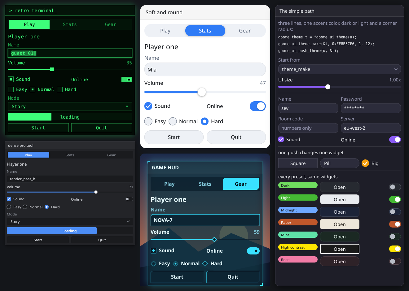
examples/anything.c in c-goome. The bottom right card goes through theme_make and every preset.